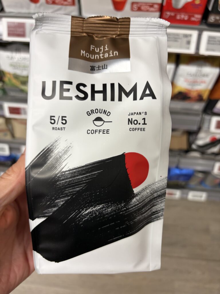
Japanese-inspired artistry, restrained typography and carefully organised information. Ueshima's Fuji Mountain coffee packaging demonstrates how saying less can communicate considerably more.
Read Observation →
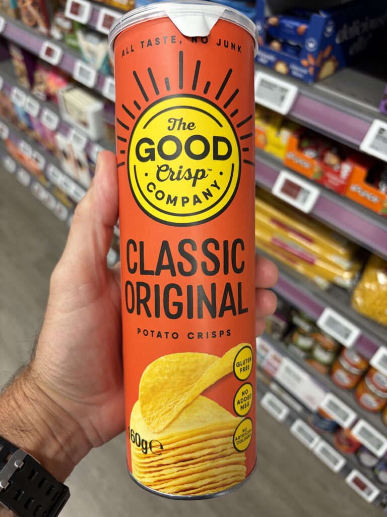
Six ingredients. Bold branding. A surprisingly simple label architecture. How The Good Crisp Company demonstrates that thoughtful formulation and regulatory communication can leave more room
Read Observation →
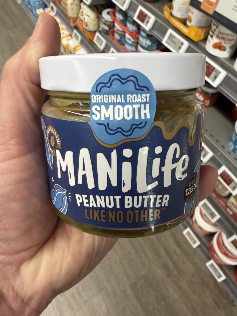
Bold typography, unconventional storytelling and just two ingredients. How ManíLife combines regulatory information, playful branding and practical packaging into a distinctly different peanut butter experience.
Read Observation →
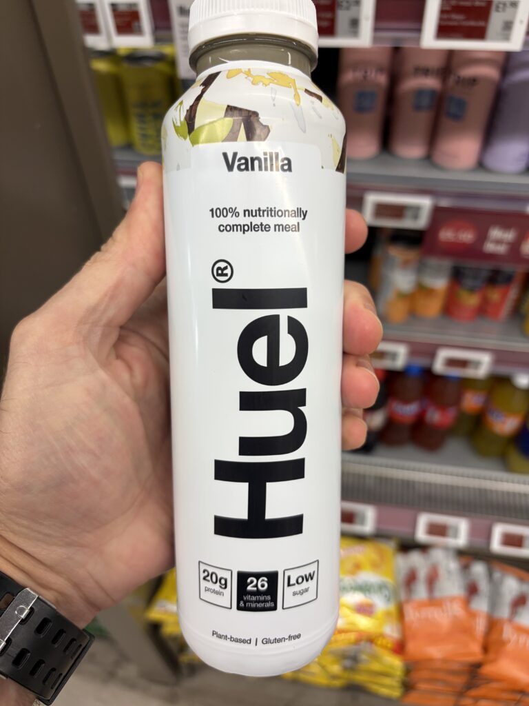
A bottle that demonstrates how bold typography, thoughtful information hierarchy and nutritional transparency can transform complex product information into a remarkably simple consumer experience.
Read Observation →
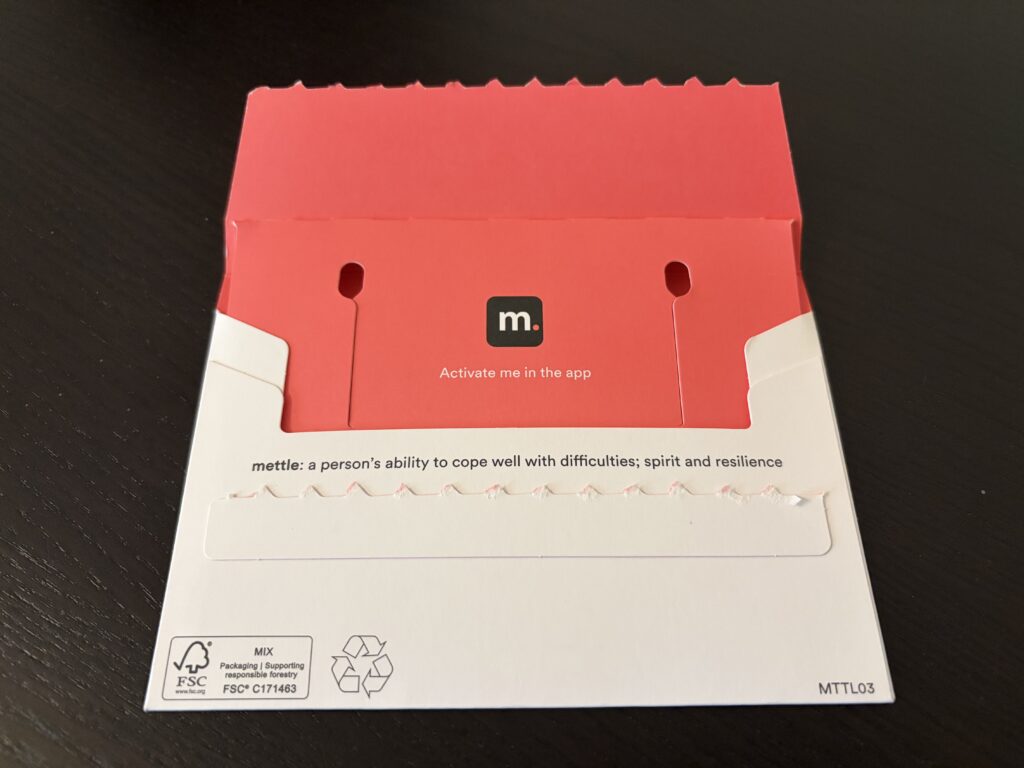
A packaging mechanism that rewards curiosity beyond the intended customer experience.
Read Observation →