Engineered By Others | Packaging & Information Architecture
Sometimes the most impressive design decisions are the ones that make complexity disappear.
Take a bottle of Huel Vanilla Ready-to-Drink.
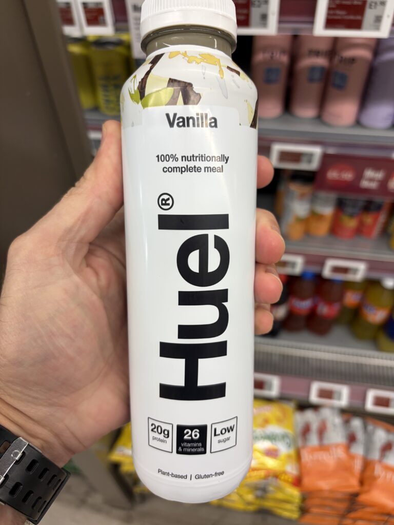
At first glance, there’s remarkably little happening. A predominantly white bottle. Bold black typography. A simple product description. A handful of nutritional highlights.
No elaborate graphics competing for attention. No unnecessary decoration.
And yet, among an increasingly crowded selection of ready-to-drink products, it’s difficult to miss.
That’s what caught our attention.
What RECS Noticed
Huel has developed an instantly recognisable visual identity around a remarkably simple principle: let the brand and the information do the talking.
The oversized, vertically arranged Huel lettering dominates the front of the bottle, while the product flavour, nutritional positioning and key benefits are presented in clearly separated areas.
The hierarchy is immediate.
First, the brand.
Then, what the product is.
Then, why someone might want it.
It’s a particularly effective example of information architecture, where typography, spacing and visual hierarchy are engineered to make communication effortless.
Less is more. But only when the less has been carefully considered.
The Engineering Behind It
The real achievement becomes apparent when the bottle is rotated.
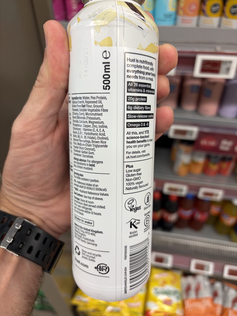
Huel is presenting a nutritionally complex product. Its packaging must communicate ingredients, allergens, nutritional composition, vitamins, minerals, serving information, storage instructions and other product particulars.
That’s a considerable amount of information to accommodate on a 500 ml bottle.
Rather than allowing this complexity to overwhelm the front-facing design, Huel distributes the information across the available packaging surface.
The front establishes identity and immediate understanding.
The side panels explain the product and its practical use.
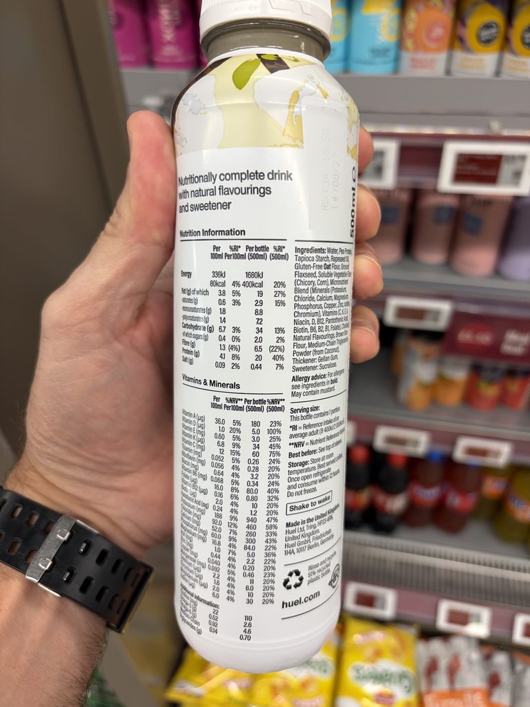
The rear provides the nutritional detail for consumers who want to investigate further.
Each area has a distinct communication purpose.
The result is a packaging system that accommodates substantial technical information without making the product appear visually complicated.
A Closer Look
Nutrition without unnecessary calculations
One of the most interesting features is the extensive nutritional information panel.
Huel provides nutritional values per 100 ml and per complete 500 ml bottle.
That second column is particularly useful.
A consumer considering the entire bottle as a meal can immediately understand what they’re consuming without multiplying every value by five.
The bottle provides 400 kcal and 20 g of protein, with a detailed breakdown of its vitamin and mineral content.
Huel also presents nutrient reference percentages, helping consumers understand how the bottle contributes towards their daily nutritional intake.
Rather than simply making a prominent nutritional claim, the packaging gives interested consumers the information needed to explore the product’s composition.
It’s an excellent example of technical information supporting the product’s central proposition.
Clear information, clearly located
The ingredients and allergen information are arranged in dedicated sections, alongside serving guidance and storage instructions.
Even relatively small details demonstrate thoughtful communication.
The instruction directing consumers to the top of the sleeve for the best-before information makes that information easier to locate.
The phrase “Shake to wake” introduces a little personality into an otherwise practical instruction.
And the product’s benefits are presented in a clearly defined panel, using consistent typography and simple visual divisions.
Nothing needs to shout over anything else.
Packaging designed to be separated
Another detail worth noticing is the perforated bottle sleeve.
The vertical perforation provides a deliberate opening point, allowing the consumer to separate the sleeve from the bottle.
Combined with the packaging’s recycling guidance, this makes the physical construction part of the communication.
The bottle doesn’t merely tell consumers about disposal. Its construction helps them take the packaging apart.
The appropriate recycling route still depends on the materials and local collection arrangements, but the intention to facilitate separation is evident.
It’s a small detail that deserves recognition.
The Thinking Behind the Solution
Huel’s wider commercial journey provides an interesting backdrop to this packaging.
Founded in 2015 by Julian Hearn and James Collier, Huel developed from an ambitious concept into an internationally recognised nutrition brand.
Its growth attracted prominent investors and advocates, including Steven Bartlett and Idris Elba.
In March 2026, Huel announced an agreement to join Danone, marking another significant chapter in the company’s development.
But what interests us here isn’t simply the commercial success.
It’s the consistency between the product proposition and the way that proposition is communicated.
Huel is selling nutritional convenience supported by detailed product formulation.
Its packaging reflects that positioning.
The visual design is direct, confident and relatively restrained.
The technical information is extensive but organised.
The brand identity remains recognisable even when surrounded by competing products.
Whether these individual packaging decisions contributed to Huel’s commercial growth would require further research. What we can observe is a strong alignment between the product, its communication and its visual identity.
Credit Where It’s Due
Recognition goes to Huel and the creative, technical, packaging and regulatory teams responsible for developing and maintaining this distinctive presentation.
The combination of visual simplicity and detailed nutritional communication is particularly worthy of acknowledgement.
The individuals and external design partners responsible for this specific packaging iteration have not yet been independently identified.
The Final Observation
Good packaging doesn’t always need an extraordinary opening mechanism, unusual materials or elaborate graphics.
Sometimes the engineering lies in deciding what information matters, where it belongs and how easily someone can understand it.
Huel’s Vanilla Ready-to-Drink bottle demonstrates how substantial technical information can coexist with a remarkably simple visual identity.
The complexity hasn’t disappeared.
It’s simply been organised so that the consumer doesn’t have to struggle with it.
And that’s an engineering decision worth celebrating.
Explore the Huel Ready-to-Drink range