Not everything needs to be polished to be brilliantly engineered.
Sometimes, the imperfections are precisely what make something interesting.
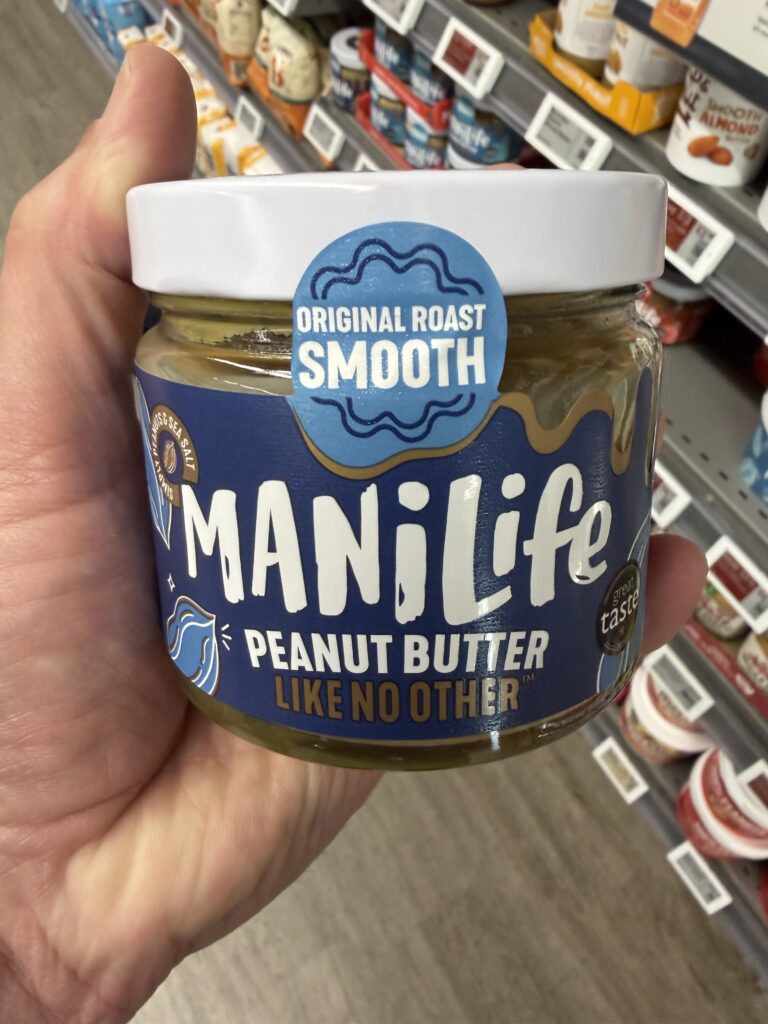
Take a jar of ManíLife Original Roast Smooth Peanut Butter.
Bold lettering. Irregular typography. Playful illustrations. Unconventional serving suggestions.
And inside?
Just two ingredients.
99.1% hi-oleic peanuts. 0.9% sea salt.
Nothing particularly complicated about that.
But the way ManíLife presents those ingredients, communicates its product information and engages with consumers is considerably more interesting than it first appears.
What RECS Noticed
The first thing that caught our attention was how deliberately unpolished the packaging appears.
Where some food brands pursue perfectly aligned typography, restrained graphics and carefully controlled minimalism, ManíLife takes a different approach.
Its lettering feels almost hand-drawn. The illustrations are playful. The information is distributed across a busy, colourful label that seems more interested in expressing personality than achieving visual perfection.
Yet it works.
The oversized ManíLife branding remains immediately recognisable, while the product name, roast style and texture are clearly communicated.
There’s a confidence in the presentation.
The packaging doesn’t appear to be trying particularly hard to look sophisticated.
Instead, it seems perfectly comfortable being itself.
And that’s what made us look closer.
The Engineering Behind It
What makes this packaging interesting is the relationship between its informal brand identity and its more structured regulatory information.
Food labelling must communicate essential information to consumers.
Ingredients, allergens, nutritional values, quantity, date marking, storage information and responsible business details all need appropriate consideration.
ManíLife accommodates these elements while maintaining its distinctive visual personality.
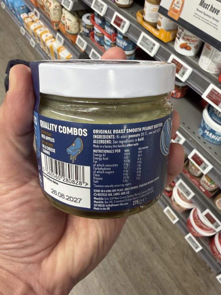
The ingredients declaration is refreshingly straightforward.
Hi-oleic peanuts (99.1%) and sea salt (0.9%).
The allergen information identifies peanuts and advises that the product is made in a factory handling other nuts.
The nutritional declaration provides values per 100 g alongside a suggested 15 g serving.
That second column is particularly useful for consumers who want to understand the nutritional contribution of a typical portion rather than calculating it themselves.
And the best-before date?
Clearly printed in a dedicated white area beneath the barcode.
It’s a good example of how technical information can remain accessible even when the surrounding design is intentionally playful.
A Closer Look
A little personality goes a long way
One of our favourite details appears beside the nutritional information.
Under the heading “Quality Combos”, ManíLife suggests pairing its peanut butter with everyday red apples.
Fair enough.
But then things get interesting.
“Bit weird in a cheese sarnie.”
A cheese sandwich?
With peanut butter?
Well, apparently somebody thought it was worth mentioning.
It’s a small piece of copy, but it reveals something important about the brand.
ManíLife isn’t simply listing conventional serving suggestions.
It’s having a conversation with its customers.
And doing so without interfering with the more technical information surrounding it.
Turning the label into a conversation
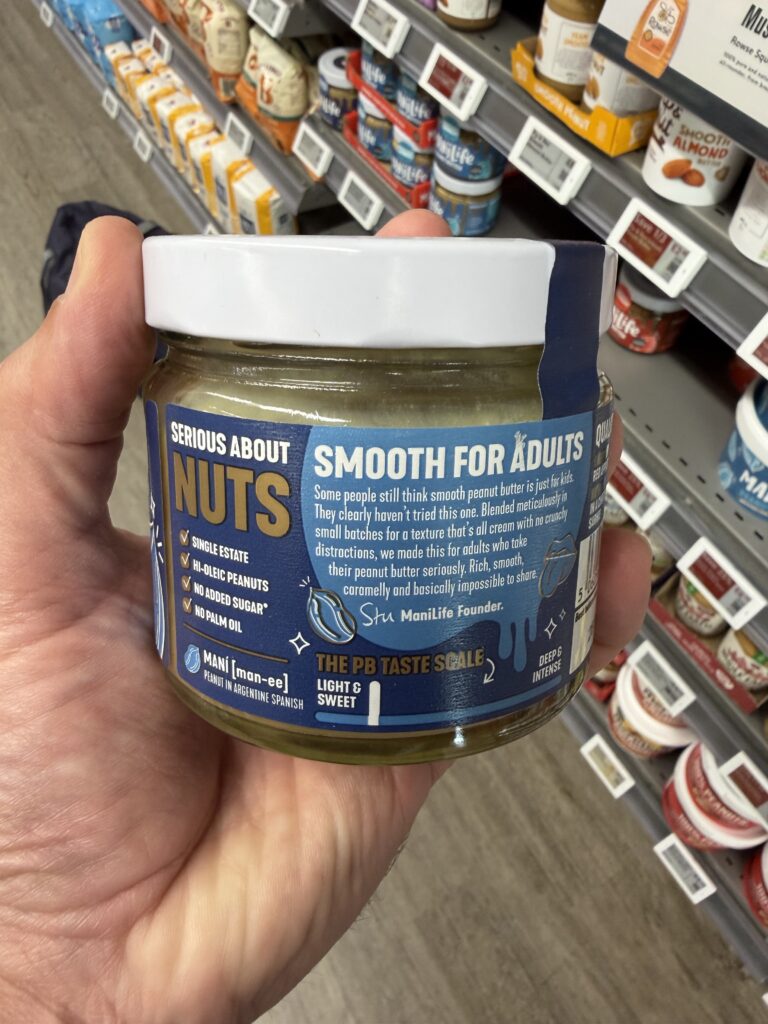
Rotate the jar and another collection of details appears.
“Serious About Nuts.”
A list of product characteristics, including single-estate peanuts, no added sugar and no palm oil.
A short message attributed to founder Stu.
An explanation of the word maní, meaning peanut in Spanish.
And even a proprietary “PB Taste Scale”, presenting the product’s flavour characteristics.
None of these elements is especially complicated.
But collectively, they transform otherwise unused packaging space into an opportunity for brand storytelling.
The consumer learns what the product contains, what makes it distinctive and a little about the personality behind it.
A reminder on the lid
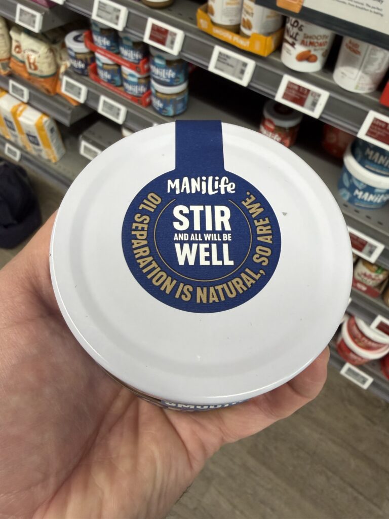
The top of the jar carries another memorable instruction:
“Stir and all will be well.”
Surrounding it is the explanation that oil separation is natural.
It’s a practical instruction presented in the same playful language used throughout the packaging.
Instead of treating natural oil separation as something to apologise for, the brand addresses it directly.
Simple. Useful. Memorable.
Packaging that understands the product
There’s also an interesting physical design decision.
The jar is relatively short and wide, with a generously sized opening.
For a thick product such as peanut butter, that matters.
Anyone who has tried scraping the last spoonful from a tall, narrow jar understands the frustration.
The wider opening makes it easier to access the contents, manoeuvre a knife or spoon and reach the sides and bottom.
It’s a modest but meaningful example of packaging usability.
The container isn’t merely protecting the product.
It’s helping the consumer use it.
The Thinking Behind the Solution
ManíLife demonstrates that good information architecture doesn’t necessarily require a minimalist visual identity.
The label is colourful, irregular and occasionally quite busy.
But that appears consistent with the brand’s personality.
The product itself is remarkably straightforward, while the packaging expresses character, enthusiasm and a slightly unconventional attitude towards peanut butter.
The contrast is part of what makes it memorable.
And importantly, the essential product information hasn’t disappeared beneath the branding.
It’s still there, organised into recognisable sections for consumers who want to investigate further.
The result is a packaging experience that balances practical communication with a distinctive personality.
Not every design needs to be perfectly polished.
Sometimes, what looks imperfect is exactly what makes it effective.
Credit Where It’s Due
Recognition goes to ManíLife, founder Stu and the creative, technical and packaging teams responsible for bringing this distinctive product presentation together.
The combination of straightforward ingredients, expressive branding, accessible product information and practical packaging deserves acknowledgement.
The individuals or external design partners responsible for this particular label and jar configuration have not yet been independently identified.
The Final Observation
There’s something particularly appealing about a product that knows exactly what it wants to be.
ManíLife doesn’t disguise its simplicity.
It celebrates it.
Two ingredients, a distinctive visual identity, a generous helping of personality and a jar designed to make the contents accessible.
The label demonstrates that regulatory information and creative expression don’t need to exist in separate worlds.
They can share the same space.
Even when that space is a little messy.
Because sometimes, the most interesting engineering isn’t about making everything perfect.
It’s about making everything work together.
Explore the ManíLife Original Roast Smooth Peanut Butter