What RECS Noticed
Sometimes, the most compelling packaging is the packaging that says the least.
Standing in front of a supermarket coffee display, surrounded by competing brands, colours and product claims, one particular package caught our attention.
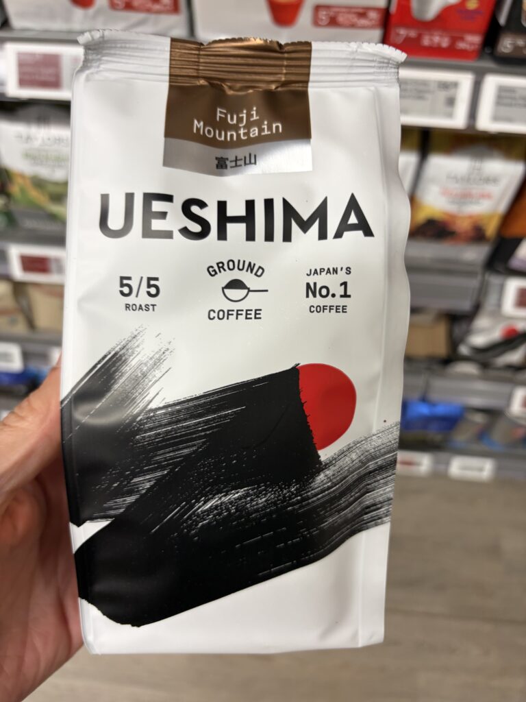
Ueshima Coffee Company’s Fuji Mountain Ground Coffee.
Not because it was louder than its competitors.
Quite the opposite.
A predominantly white package. A bold black brushstroke. A restrained red circle. And a subtle bronze metallic finish.
The visual language immediately evokes Japanese artistic traditions, where simplicity, contrast and deliberate composition can communicate extraordinary depth.
There was no overwhelming collection of marketing claims competing for attention.
Just a beautifully restrained presentation of what the product is, where its identity comes from and why it might be worth exploring.
We hadn’t tasted the coffee.
But the packaging had already done something remarkable.
It made us stop, pick it up and look closer.
The Engineering Behind It
When simplicity becomes the design
One of the most interesting aspects of Ueshima’s packaging is how little information it needs to communicate on the front.
The hierarchy is immediately understandable:
UESHIMA
FUJI MOUNTAIN
GROUND COFFEE
5/5 ROAST
Each element serves a distinct purpose.
The brand establishes identity.
Fuji Mountain identifies the particular product.
Ground Coffee communicates its format.
And the roast-strength indicator gives consumers an immediate understanding of its intended intensity.
Alongside these elements sits the brand’s claim of being Japan’s No. 1 coffee.
Yet none of this information competes with the artwork.
Instead, the typography and graphics complement one another.
The striking black brushstroke, textured to suggest traditional Japanese ink painting, creates movement across an otherwise restrained white background.
A red circular element provides contrast and an unmistakable visual connection to Japan.
The result is packaging that feels expressive without becoming complicated.
The design doesn’t need to shout about quality. It creates an impression of quality through restraint.
And that’s an interesting engineering achievement in itself.
A Closer Look
Four surfaces. Four distinct purposes.
What initially appears to be a simple coffee package reveals a carefully organised information architecture when examined from every angle.
The front: Identity and recognition
The front panel prioritises brand recognition, product identification and visual impact.
There is a clear hierarchy between the Ueshima name, Fuji Mountain designation, coffee format and roast strength.
The remaining space belongs largely to the artwork.
Rather than treating empty space as something that needs filling, the design makes it part of the presentation.
The rear: Information without clutter
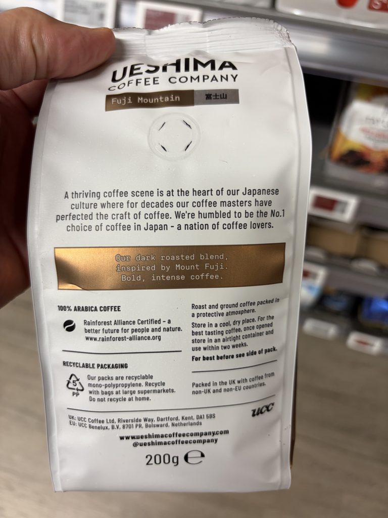
Turning the package over reveals a structured arrangement of product and consumer information.
The upper section introduces Ueshima’s Japanese coffee heritage and describes the Fuji Mountain blend.
Below this, the package provides information including:
- 100% Arabica coffee identification.
- Rainforest Alliance certification.
- Storage recommendations and instructions following opening.
- Protective-atmosphere packaging information.
- Recycling guidance.
- UK and EU business contact details.
- Country-of-packing and coffee-origin information.
- Net quantity declaration.
Despite the amount of information presented, the panel remains relatively easy to navigate.
The different elements are grouped logically, with sufficient separation to distinguish product storytelling from practical consumer information.
The first side: Helping the consumer enjoy the product
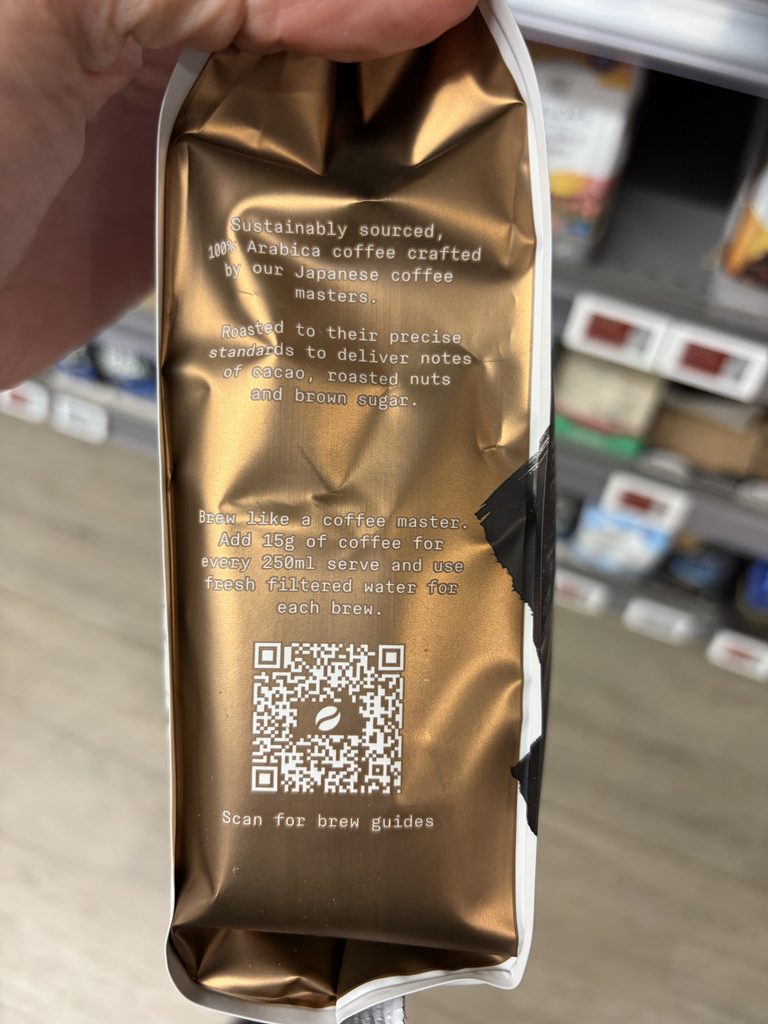
The first bronze side panel introduces another dimension to the packaging.
Rather than using this surface simply for additional marketing, Ueshima provides practical brewing guidance.
Consumers are advised to use 15g of coffee for every 250ml serving, with freshly filtered water.
A QR code directs interested consumers towards further brewing information.
It’s a small but worthwhile addition.
The packaging doesn’t simply explain what the product is.
It helps consumers understand how to use it.
And the bronze metallic background gives this otherwise practical information a distinctive visual identity.
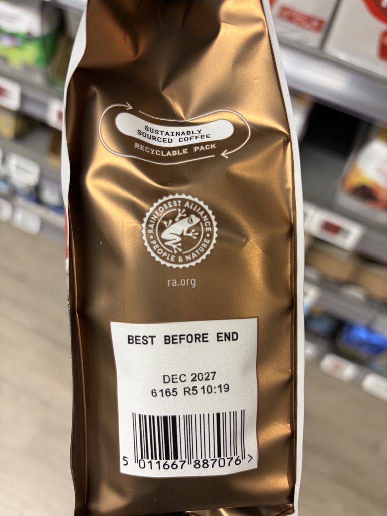
The second side: Information where it belongs
The opposite side panel carries further sustainability messaging, the Rainforest Alliance identity, the best-before declaration and barcode.
These are important elements of the overall packaging architecture.
But they don’t need to dominate the front.
By distributing information across the available surfaces, Ueshima maintains a clean visual presentation without sacrificing practical detail.
The result is a package in which each surface has a recognisable role.
The Thinking Behind the Solution
Regulatory simplicity creates room for creativity
One particularly interesting aspect of this product is what doesn’t appear on its packaging.
There is no conventional ingredients list.
And there is no nutrition information table.
For an ordinary packaged food product, those omissions might initially seem surprising.
However, plain ground coffee benefits from specific provisions within the food-information regulations applicable in Great Britain.
Under Article 19 of Regulation (EU) No 1169/2011, as applicable in Great Britain, certain single-ingredient foods do not require a separate ingredients list where the product name clearly identifies the ingredient.
Similarly, Annex V specifically exempts whole or milled coffee beans from the requirement to provide a mandatory nutrition declaration.
For a product consisting of plain ground coffee, these provisions allow a considerably simpler regulatory information architecture than would be necessary for many other food and beverage categories.
This is where the relationship between regulatory engineering and creative design becomes particularly interesting.
The absence of unnecessary information isn’t necessarily an omission.
Sometimes, it’s the result of understanding exactly what information the product needs to communicate.
And when the regulatory requirements are comparatively straightforward, the available packaging space can be used more deliberately.
For Ueshima, that means greater freedom to express its visual identity, communicate its heritage and provide practical brewing guidance.
Good regulatory engineering isn’t about putting more information on a label. It’s about understanding what belongs there in the first place.
The Thinking Behind the Design
A premium experience without unnecessary complexity
Another aspect worth celebrating is the packaging’s use of contrasting finishes.
The predominantly white front creates a clean canvas for the black artwork and red circular motif.
The bronze metallic accents then introduce an additional visual dimension.
They suggest warmth, richness and refinement without requiring elaborate illustrations or excessive decorative elements.
That contrast carries through to the side panels, creating a cohesive presentation when the package is viewed from different angles.
There is also something particularly effective about the relationship between the artwork and the product itself.
Coffee is a product associated with ritual, preparation and sensory experience.
The packaging’s restrained Japanese-inspired aesthetic complements those associations.
It communicates a sense of care and considered presentation before the consumer has even opened the bag.
Of course, visual design cannot establish the quality of the coffee itself.
That can only be determined by experiencing the product.
But it can influence whether somebody decides to investigate it.
In this case, it certainly did.
Credit Where It’s Due
Ueshima Coffee Company deserves recognition for a packaging presentation that brings together product identity, Japanese-inspired visual design and practical consumer information.
The Fuji Mountain packaging demonstrates how an established product category can still offer opportunities for distinctive communication.
Its artwork creates immediate recognition.
Its information hierarchy makes the product easy to understand.
Its side panels provide useful additional information without overwhelming the primary presentation.
And its overall restraint gives the package a sense of quality that doesn’t depend on excessive marketing language.
The individual designers, packaging engineers and creative teams responsible for this particular execution have not been independently identified.
Nevertheless, their work deserves to be noticed.
Because creating something that appears effortless often requires considerable thought about what to include, what to emphasise and, perhaps most importantly, what to leave out.
The Final Observation
We haven’t tasted Ueshima’s Fuji Mountain coffee.
Not yet.
But we picked it up.
We examined it.
We photographed it.
And we wanted to understand why its packaging was so effective.
That’s a meaningful achievement for something sitting on a supermarket shelf alongside dozens of competing products.
The packaging communicated enough to attract attention, but not so much that it overwhelmed the product.
It balanced artistic expression with regulatory information.
It made space for the consumer to appreciate the design.
And it demonstrated something we particularly enjoy recognising through Engineered By Others.
Sometimes, the most intelligent design decision is knowing when to stop adding things.
Well engineered, Ueshima.
We noticed.
Explore Ueshima Coffee Company’s Fuji Mountain Ground Coffee