Sometimes, what a product leaves out is just as interesting as what it puts in.
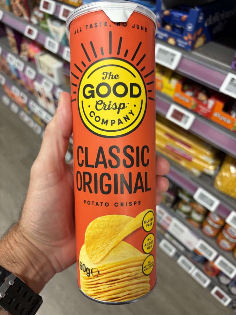
There’s something immediately familiar about The Good Crisp Company’s Classic Original potato crisps.
The tall cylindrical container. The unmistakable shape. The promise of neatly stacked crisps inside.
It’s a packaging format we’ve all seen before.
But what caught our attention wasn’t necessarily the container itself.
It was how confidently The Good Crisp Company used that familiar format to communicate something different.
Bright orange-red packaging. Bold black typography. A distinctive yellow brand identity.
And three words sitting proudly across the top:
All Taste, No Junk.
It’s loud, colourful and impossible to miss.
Yet there’s something surprisingly restrained about it.
And when we turned the container around, we discovered why.
What RECS Noticed
Six ingredients. A remarkably simple message.
The Good Crisp Company’s Classic Original potato crisps contain just six declared ingredients:
Dried potato flakes, palm oil, tapioca starch, salt, sugar and white pepper.
That’s it.
No lengthy list of additives. No complicated ingredient descriptions. No elaborate explanation required to understand what’s inside.
What makes this particularly interesting from a regulatory engineering perspective is the relationship between the product’s formulation and the information required to communicate it.
Food labels have a job to do.
They must accommodate applicable regulatory information, including ingredients, nutritional values, business details, net quantity and other relevant particulars.
All within a limited physical space.
But when a product has a relatively straightforward formulation, some of that information becomes easier to communicate.
And that’s where The Good Crisp Company appears to have found an opportunity.
Less complexity in the product’s composition creates more room for creativity in its presentation.
Rather than filling the packaging with dense explanations, the company uses that space to express its personality.
It’s a great example of how regulatory information and creative branding can complement one another.
The Engineering Behind It
Loud, but restrained
The front of the container is an excellent example of visual hierarchy.
The Good Crisp Company logo sits prominently against its bright orange-red background.
Below it, the product identity is immediately clear:
Classic Original. Potato Crisps.
There’s no ambiguity about what you’re buying.
The product image reinforces that message, while three simple circular claims communicate additional characteristics:
- Gluten Free
- No Added MSG
- No Artificial Colours
Despite the bold colours and oversized typography, the packaging never feels unnecessarily crowded.
There’s plenty of breathing room between the different elements.
Everything has its place.
And everything serves a purpose.
Regulatory information without unnecessary complexity
Turn the container around and the contrast becomes even more interesting.
The nutritional declaration is presented in a straightforward table, providing information per 100g and per 28g serving.
The packaging also identifies approximately five to six servings per container.
That additional serving information gives consumers a useful reference for understanding what a typical portion contributes nutritionally.
Immediately below sits the ingredients declaration.
Six ingredients, presented clearly and concisely.
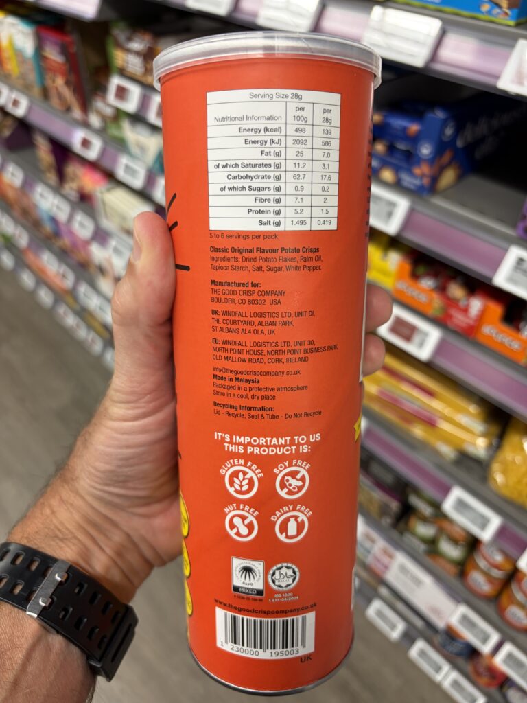
The remaining regulatory and practical information follows in an organised sequence, including business addresses, country of manufacture, storage guidance and recycling instructions.
There’s no need for an elaborate information architecture because the underlying product information is comparatively straightforward.
The simplicity of the formulation becomes part of the simplicity of the label.
Small details that make a difference
One particularly useful feature is the recycling information.
Rather than suggesting that the entire container should be recycled together, the label distinguishes between its components:
Lid — Recycle. Seal & Tube — Do Not Recycle.
It’s a practical acknowledgement that different materials require different disposal decisions.
Similarly, the packaging directs consumers to the base of the container for the best-before date.
And that’s exactly where it appears.
These are small details.
But they’re examples of the kind of thoughtful information placement that makes packaging easier to understand and use.
A Closer Look
When the regulatory information leaves room for personality
Perhaps the most interesting part of this packaging isn’t the front or the nutritional panel.
It’s what the company does with the remaining space.
One entire section introduces Matt, the founder, and explains how his desire to find crisps he could share with his three daughters helped inspire the business.
There’s even a family photograph.
It’s personal, approachable and refreshingly uncomplicated.
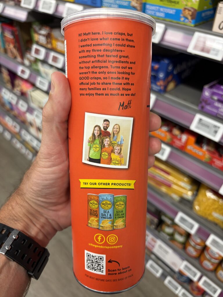
Rather than using every available centimetre to repeat product claims, the company uses the packaging to introduce the people and motivations behind the brand.
Elsewhere, there’s a small presentation of other products in the range, social media information and a QR code inviting consumers to discover more.
All of these elements contribute to the product’s identity.
But none overwhelms the essential information.
The packaging manages to accommodate regulatory particulars, product claims, brand storytelling and consumer engagement without appearing unnecessarily complicated.
That’s the part we find particularly impressive.
A familiar container with a different proposition
The cylindrical crisp container is a recognisable packaging format.
The Good Crisp Company doesn’t attempt to disguise that familiarity.
Instead, it uses the established format as a starting point for communicating its own identity.
Its differentiation comes from the product proposition, ingredients, branding and personality rather than an entirely new packaging structure.
That’s an interesting design decision in itself.
Sometimes, you don’t need to reinvent the container.
You need to rethink what the container communicates.
The Thinking Behind the Solution
What happens when product simplicity becomes a brand advantage?
The Good Crisp Company presents an interesting relationship between formulation and communication.
Its comparatively short ingredient declaration supports the brand’s emphasis on simplicity.
Its bold visual identity makes that proposition noticeable.
Its clear nutritional and regulatory information gives consumers an opportunity to examine the product more closely.
And its founder’s story adds a human dimension.
These elements reinforce one another.
The company isn’t relying solely on attractive packaging to communicate its proposition.
Nor is it relying solely on the ingredients list.
It’s the combination that makes the approach interesting.
From a regulatory engineering perspective, this illustrates an important principle:
Regulatory information doesn’t have to be treated as an obstacle to creative design.
When thoughtfully organised, it can become part of a coherent product identity.
And when the product itself is comparatively straightforward, the communication can reflect that simplicity.
The result is a container that feels confident, approachable and distinctly its own.
Credit Where It’s Due
The Good Crisp Company deserves recognition for bringing together product formulation, regulatory communication and brand personality in such an accessible way.
Its packaging makes a strong first impression.
But it also rewards a closer look.
The ingredients are easy to identify.
The nutritional information is presented in useful quantities.
The recycling instructions distinguish between different components.
The founder’s story provides a human connection.
And the overall design remains remarkably uncluttered despite its bold appearance.
We originally picked up the container because it caught our attention.
We kept examining it because the information architecture was interesting.
And we ultimately bought it because the product proposition appealed to us.
As it turns out, the crisps tasted pretty good too.
Sometimes, the best product experiences are the ones where everything simply works together.
The Final Observation
Less in the ingredients list. More room for personality.
The Good Crisp Company demonstrates how simplicity in one part of a product can create opportunities elsewhere.
A relatively straightforward formulation supports clear ingredient communication.
Thoughtful regulatory information leaves room for creative expression.
And confident branding turns a familiar packaging format into something distinctive.
It’s not about eliminating information.
It’s about organising the information that matters and allowing everything else to work around it.
Because good regulatory engineering doesn’t have to compete with creativity.
Sometimes, it creates the space for creativity to flourish.
And that’s something worth noticing.
Explore The Good Crisp Company’s Classic Original Potato Crisps